What to have and not have on a website that ACTUALLY gets clients!
Why NOT design your website’s home page to attract prospects?
Wow, you’ve been doing some great work promoting your business and people are checking out your website, so how come no one is calling, emailing or messaging you? Chances are the website’s home page is missing a few very key and important elements that keep users interested.

The most important thing a website needs to do is grab the users attention, the last thing that you want to happen is for someone to land on your site and then immediately leave it.
But, that’s exactly what’s happening and you’ve got about 8 seconds to change that. Internet searchers are impatient, and if they don’t see what they want in 8 seconds or less, they hit the ‘back’ button. When that happens, you’ve lost them for good.
Scientific eye-tracking studies have shown that readers can’t, or won’t, read blocks of text. What does that mean for your website?
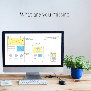
It means your website home page needs to follow the KIS method. KEEP IT SIMPLE ( and clean). Your pages must be easy to scan for the important information people want to know.
- Contact information and a dynamic phone number ( that means press to call)
- Where is your business located
- What your business does (how can you help them)
- A few bullet points about your service (emphasis on the few)
Well-designed graphics catch the eye and tell a story at a glance, so a picture is worth more than a thousand words. That means stick to quick-loading images (that have an impact) and short concise sentences.
Contact information and a clickable phone number … That means press to call directly from the website
Make it easy and super simple for your prospect to contact you. Contact information should always be on the homepage near the top and normally on the right top corner. Phone numbers should always be clickable. A clickable phone number means you just need to click it and it’s making the call. Did you know over 50% of internet searches happen on mobile? So not having a clickable phone number (click to call) on your website is like telling half of your potential new clients not to bother contacting you.
Where are you located?
How many times have you found exactly what you’re looking for only to find out its 1000 miles away? Your homepage should always easily convey your address or at least a city location. Add your name, address and phone number (again) to the footer. Do you provide your product or service to a national or global audience? Make it clear on your homepage. The easiest way to quickly show your location is to have that shown on your website footer. That way it will show up on every page.
What does your business do?
Think of your homepage as an elevator pitch you want to be able to explain your service or product well and quickly. Leave the detailed information for your services and product pages. Remember, a well designed and informative website has its own page for each product and service you provide.
Add a few bullet points about your service
Let the reader know what it is you provide in a few bullet points or sentences. Make sure you include what separates your business from others but, remember to keep it simple. Details belong to specific pages, not the homepage.
Each service or product you want to promote needs its own ‘landing’ page – a page devoted to one product or service. Each page should have one clear message – other messages should go on other pages. Your site will be cleaner this way. Focus the attention on each specific offer and you control what the user sees.
Making your pages more focused also helps people find your offers easier when they search for your products and services. When the search engines understand clearly what a page is about it will show it in the search results. The search engines rank pages, not websites. A focused message makes it easier for the search engines to understand the main point of each page and rank it accordingly. That means when someone does a search for your service or product they have an easier time landing on your website because the search engine (or bots) can match them to your website more accurately.

Each focused (or ‘optimized’) page, concentrating on a single topic will be found easier by search engines and by your prospects that are looking for your services or products. This way people looking for a solution to their problem will be brought directly to your page showing them your solution and offer.
Bring the right people to the right page and you will convert more of your visitors into buyer
When deciding on what to put on your website’s homepage, how to design it, remember …
KIS – Keep it Simple
Less is More
A Picture is worth a thousand words.
Looking for more information and help with building a website?
Book an appointment for a complementary 45-minute consultation
and have your specific questions answered.


